Viewing report results
Your report results are initially shown as a table, with a column for the grouping and filters you selected, and a column for each of the selected metrics. Report results use your local time zone.
Use the arrows next to each first-level attribute to expand or collapse the second-level attribute content below it.
Use the options in the toolbar to define how you display and navigate through report results:
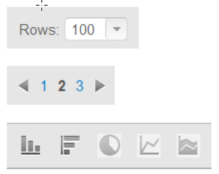
Select the number of rows to see on each page. The default is 100 rows; you can also select 50, 150, or 200 rows.
Use the arrow keys to page through longer reports, and quickly jump to specific pages.
View the report results as one of the following:
- column chart
- bar chart
- pie chart
- line chart
- area chart
Hover the mouse over an item in a chart to see more information, for example a percentage or a number of hits.
All of these charts are available for a single- level grouping report. For grouping reports with 2 attributes, only column and bar charts are available.
Each item in the report has a check box. Select one or more check boxes to open a pop-up window that enables you to:
- Drill down into more detailed information. See Drilling into report items.
- Show only the report items you have selected
- Filter out the report items you have selected
- View individual transactions for the items you have selected.
- Cancel any selections you have made.