Chart
These widgets are designed to help users tailor the display of data analytics to their preferences for better interpretation and presentation of data insights. They can have multiple types: Horizontal Bar, Vertical Bar, Line, Ares, or Pie.
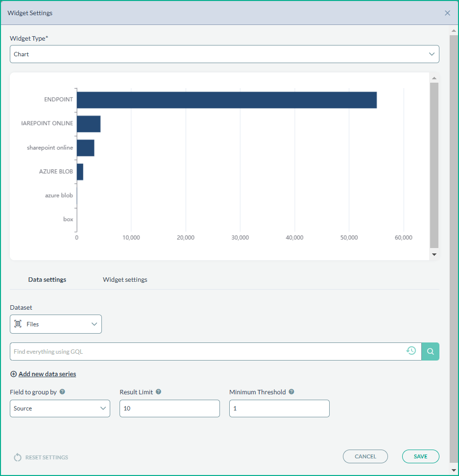
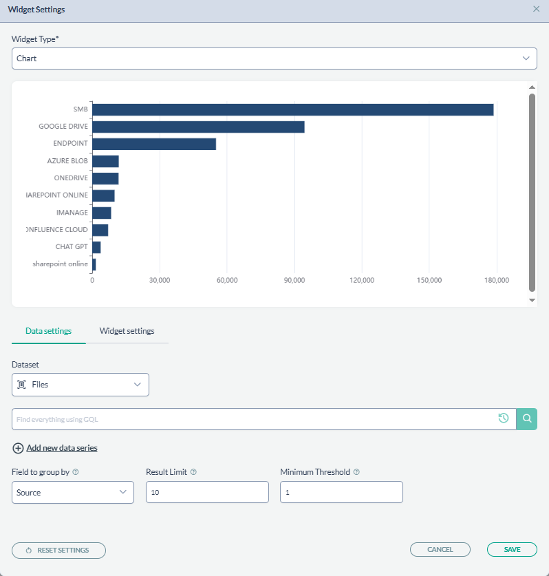
Data settings
This tab allows users to select the type of dataset to visualize (e.g., files or trustees) and use GQL for specific queries. The 'Field to group by' feature is used to categorize data, with adjustable limits on the results displayed and thresholds for inclusion in the visualization.
Widget Settings
Users can adjust general settings like chart type, add a title, adjust margins for clarity, and choose a color palette for the chart. Options for additional customizations such as enabling grid lines or flipping colors for visual differentiation are also present.
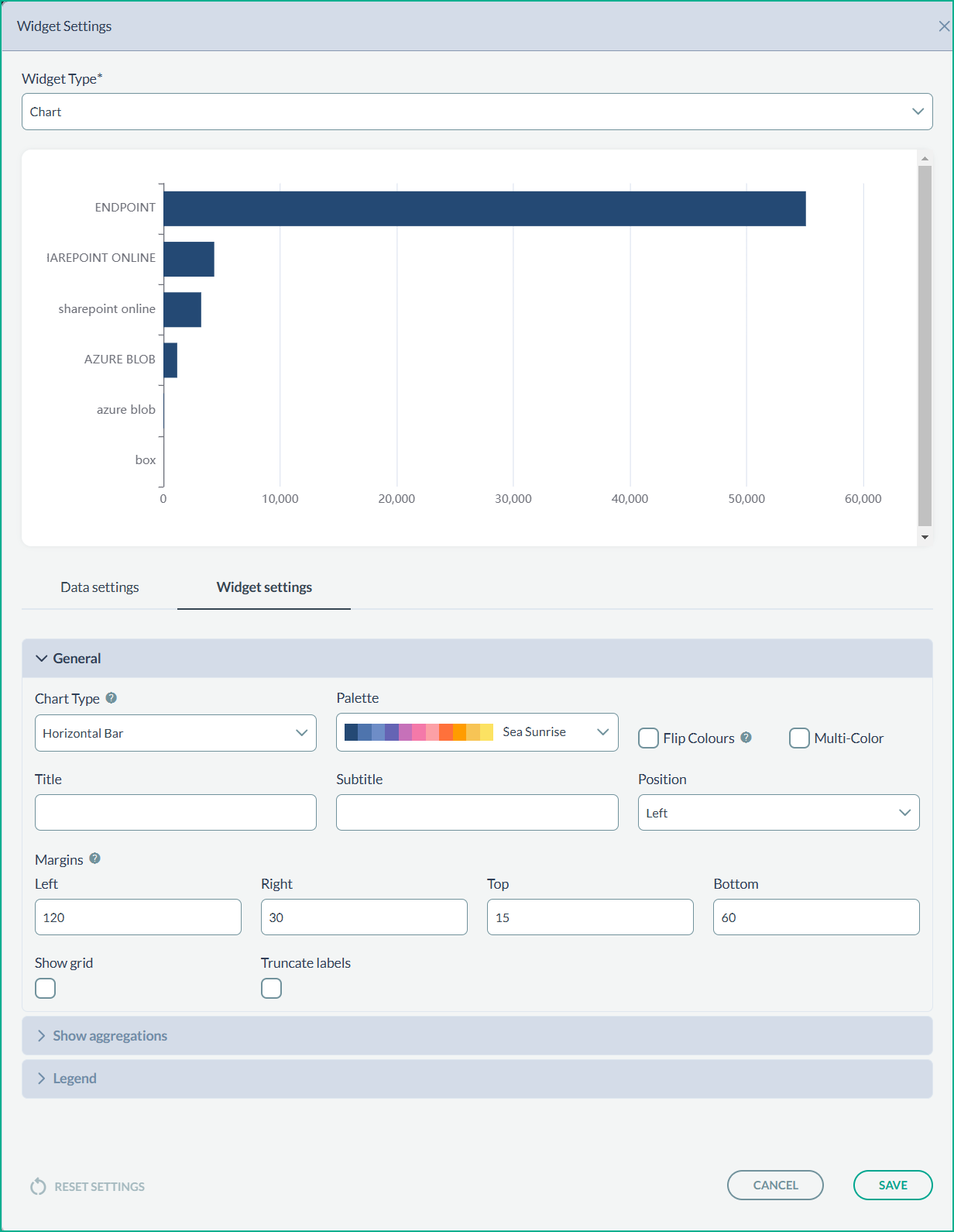
The Show aggregations section has options to aggregate the data using functions.
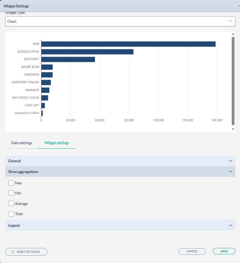
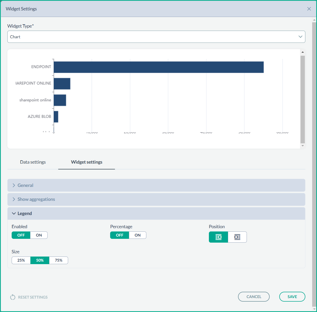
The Legend section has toggles for enabling a legend display and showing percentages, with adjustments for size and positioning on the chart.