Data Security
Use the Data Security dashboard for an overview of your use of Forcepoint ONE to secure and protect your data across your licensed channels—API, CASB Inline and Web.
While viewing any other dashboard or page, click the ![]() icon to access the Data Security
dashboard.
icon to access the Data Security
dashboard.
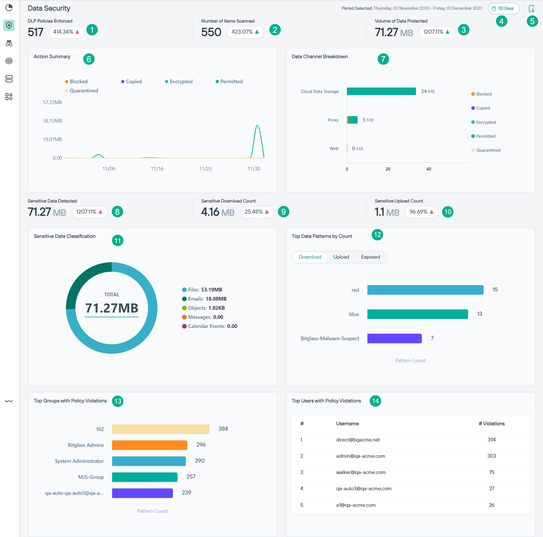
- 1
- DLP Policies Enforced: Indicates the number of times DLP policies was enforced for the selected period and percentage of number of times DLP policies was enforced when
compared to previous period along with the
 or
or  icon indicating if the DLP policies
enforced have increased or decreased for current period when compared to previous period.
icon indicating if the DLP policies
enforced have increased or decreased for current period when compared to previous period. - 2
- Number of Items Scanned: Indicates the number of items scanned for the selected period and percentage of number of items scanned when compared to previous period along
with the or icon indicating if the items scanned have increased or decreased for
current period when compared to previous period.
- 3
- Volume of Data Protected: Indicates the volume of data protected for the selected period and percentage of volume of data protected when compared to previous period
along with the or icon indicating if the data protected have increased or decreased
for current period when compared to previous period.
- 4
- Time filter: Click the time filter to view the past 7 days, 14 days, 30 days, 45 days or 60 days data for all widgets on the dashboard. By default, dashboard loads with a 30 days' time filter.
- 5
- Export to PDF: Click the
 icon to export the dashboard in PDF.
 - 6
- Action Summary: Indicates the summary of DLP actions taken when the data was scanned. The Action Summary chart is represented in a line chart with number of actions in X
axis and volume of data scanned in Y axis for each DLP action.
You can place the mouse pointer along the line to know the details at that point.
- 7
- Data Channel Breakdown: Indicates the summary of DLP actions taken when the data was scanned for each channel.
- 8
- Sensitive Data Detected: Indicates the volume of sensitive data detected for the selected period and percentage of volume of sensitive data detected when compared to
previous period along with the or icon indicating if the sensitive data detected have
increased or decreased for current period when compared to previous period.
- 9
- Sensitive Download Count: Indicates the volume of sensitive data downloaded for the selected period and percentage of volume of sensitive data downloaded when compared
to previous period along with the or icon indicating if the sensitive data downloaded
have increased or decreased for current period when compared to previous period.
- 10
- Sensitive Upload Count: Indicates the volume of sensitive data uploaded for the selected period and percentage of volume of sensitive data uploaded when compared to
previous period along with the or icon indicating if the sensitive data uploaded have
increased or decreased for current period when compared to previous period.
- 11
- Sensitive Data Classification: Indicates classification of sensitive data in donut chart along with the total volume of sensitive data scanned.
When you place the mouse pointer on the donut chart, it displays the classification name along with percentage of classification.
You can also turn off pieces of the donut chart by clicking the bulleted classification on the side to hide the data related to selected classification.
- 12
- Top Data Patterns by Count: Indicates the top 5 data patterns for each of the actions (download, upload and exposed). Each horizontal bar of the data pattern displays
data pattern name, number of times data pattern was downloaded, uploaded or exposed along with the or icon indicating if the data pattern downloaded, uploaded or exposed have increased or decreased for current period when compared to previous period.
- 13
- Top Groups with Policy Violations: Indicates the top 5 user groups with most policy violations across the selected time period.
- 14
- Top Users with Policy Violations: Lists the top 5 users with most policy violations along with the number of policy violations across the selected time period.